Jointers
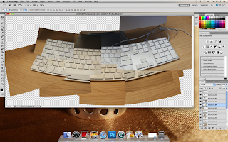
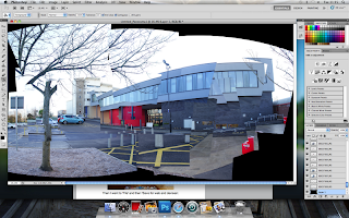
I like this style of photography, making up a picture of something like a chair from lot of little pictures from different angles of the chair.
They all kind of fit together in a random kind of way.
I research David Hockney's photography on google.
The "Joiners"
"David Hockney has also worked with photography, or, more precisely, photocollage. Using varying numbers of small Polaroid snaps or photolab-prints of a single subject Hockney arranged a patchwork to make a composite image. One of his first photomontages was of his mother. Because these photographs are taken from different perspectives and at slightly different times, the result is work that has an affinity with Cubism, which was one of Hockney's major aims – discussing the way human vision works. Some of these pieces are landscapes such as Pearblossom Highway #2, others being portraits, e.g. Kasmin 1982, and My Mother, Bolton Abbey, 1982.
Hockney created these photomontage works mostly between 1970 and 1986. He referred to them as "joiners". He began this style of art by taking Polaroid photographs of one subject and arranging them into a grid layout. The subject would actually move while being photographed so that the piece would show the movements of the subject seen from the photographer's perspective. In later works Hockney changed his technique and moved the camera around the subject instead.
Hockney's creation of the "joiners" occurred accidentally. He noticed in the late sixties that photographers were using cameras with wide-angle lenses to take pictures. He did not like such photographs because they always came out somewhat distorted. He was working on a painting of a living room and terrace in Los Angeles. He took Polaroid shots of the living room and glued them together, not intending for them to be a composition on their own. Upon looking at the final composition, he realised it created a narrative, as if the viewer was moving through the room. He began to work more and more with photography after this discovery and even stopped painting for a period of time to exclusively pursue this new style of photography. Frustrated with the limitations of photography and its 'one eyed' approach, he later returned to painting."
I found an artical on a London website, saying that David Hockney's work is on display down there.
In it he is asked about the iPad and how it has changed the way people can draw and create art.
Interviewer: "Do you think it's cheating?"
Hockney: "Not really the iPad is very, very direct. I would point out that Turner probably used Water Colour because it was a quicker media then Oil Paint for getting down fleeting effects. But if you find a media even faster, any artist will be interested if that's what they are doing and looking at. It's a very serious media."
Cubism
"Synthetic Cubism was the second main movement within Cubism that was developed by Picasso, Braque, Juan Gris and others between 1912 and 1919. Synthetic cubism is characterised by the introduction of different textures, surfaces, collage elements, papier collé and a large variety of merged subject matter. It was the beginning of collage materials being introduced as an important ingredient of fine art work.
Analytic Cubism
The invention of Cubism was a joint effort between Pablo Picasso and Braque, then residents of Montmartre, Paris. These artists were the movement's main innovators. A later active participant was Juan Gris. After meeting in 1907 Braque and Picasso in particular began working on the development of Cubism. Picasso was initially the force and influence that persuaded Braque by 1908 to move away from Fauvism. The two artists began working closely together in late 1908–early 1909 until the outbreak of World War I in 1914. The movement spread quickly throughout Paris and Europe.
Cubism today
Far from being an art movement confined to the annals of art history, Cubism and its legacy continue to inform the work of many contemporary artists. Not only is cubist imagery regularly used commercially, but significant numbers of contemporary artists continue to draw upon it both stylistically and perhaps more importantly, theoretically. The latter contains the clue as to the reason for cubism's enduring fascination for artists. As an essentially representational school of painting, having to come to grips with the rising importance of photography as an increasingly viable method of image making, cubism attempts to take representational imagery beyond the mechanically photographic, and to move beyond the bounds of traditional single point perspective perceived as though by a totally immobile viewer. The questions and theories which arose during the initial appearance of cubism in the early 20th century are, for many representational artists, as current today as when first proposed.
Georges Braque
Braque's paintings of 1908–1913 reflected his new interest in geometry and simultaneous perspective. He conducted an intense study of the effects of light and perspective and the technical means that painters use to represent these effects, seeming to question the most standard of artistic conventions. In his village scenes, for example, Braque frequently reduced an architectural structure to a geometric form approximating a cube, yet rendered its shading so that it looked both flat and three-dimensional by fragmenting the image. He showed this in the painting "House at L'estaque".
A decisive time of its development occurred during the summer of 1911, when Georges Braque and Pablo Picasso painted side by side in Céret in the French Pyrenees, each artist producing paintings that are difficult—sometimes virtually impossible—to distinguish from those of the other. In 1912, they began to experiment with collage and papier collé.
Beginning during 1909, Braque began to work closely with Pablo Picasso, who had been developing a similar style of painting. At the time Pablo Picasso was influenced by Gauguin, Cézanne, African tribal masks and Iberian sculpture, while Braque was interested mainly in developing Cézanne's ideas of multiple perspectives. “A comparison of the works of Picasso and Braque during 1908 reveals that the effect of his encounter with Picasso was more to accelerate and intensify Braque’s exploration of Cézanne’s ideas, rather than to divert his thinking in any essential way.” Braque’s essential subject is the ordinary objects he has known practically forever. Picasso celebrates animation, while Braque celebrates contemplation. Thus, the invention of Cubism was a joint effort between Picasso and Braque, then residents ofMontmartre, Paris. These artists were the style's main innovators. After meeting in October or November 1907, Braque and Picasso, in particular, began working on the development of Cubism in 1908. Both artists produced paintings of monochromatic colour and complex patterns of faceted form, now termed Analytic Cubism.
French art critic Louis Vauxcelles first used the term Cubism, or "bizarre cubiques", in 1908 after seeing a picture by Braque. He described it as 'full of little cubes', after which the term quickly gained wide use although the two creators did not adopt it initially. Art historian Ernst Gombrich described cubism as "the most radical attempt to stamp out ambiguity and to enforce one reading of the picture—that of a man-made construction, a coloured canvas." The Cubist style spread quickly throughout Paris and then Europe."
This is some of his work that I liked.
I think Cubism and David Hockney are very similar . I think that Hockney really took inspiration from Cubism and really made it his own. I really like his Photomontages and they way that he paints with so much colour and shape. Intrigued by how cubist painters incorparated multiple viewpoints of a single subject, British artist David Hockney applied it to the medium of photography.
Keith Hammond
This is his website. I was looking at all the jointers that he has made. These two are my favourites.
These are my favourite 'Jointers' by Keith Hammond. I like how he has added the seagul into the shot.
Photomontage
Photomontage is the process and result of making a composite photograph by cutting and joining a number of other photographs. The composite picture was sometimes photographed so that the final image is converted back into a seamless photographic print. A similar method, although one that does not use film, is realised today through image-editing software. This latter technique is referred to by professionals as "compositing", and in casual usage is often called "photoshopping".
Buildings
A photomontage picture by Andrew Rodrigues
Basque health department.
This building looks like it has had different pictures taken of it and stuck in different places, but it is really built like this.
Building like this are great for photomontages.
Like this one of the Millennium centre in Cardiff. They have got the whole of the building and the water tower in the shots and I think it creates such a great line of photos. I love the way they have taken the pictures of the Centre in such a way that it bulges out like it would on a fisheye lens.
Cutting and sticking
Water
Water can look like so many different shapes when you capture it as it's falling, dripping and spraying.
I think they look like they have been put together, like the still water is made of plastic and has been modelled like clay.
Media/adverts that use cubism
This is an advert that combines a kind of montage of cartoon and film that is kind of like cubism.
It is very clever in that when there in the white 'sheet' that sweeps over the car the shape of the car that is covered turns into words.
This is another car advert that uses that kind of uses Cubism.
using TV sets and using images of the car on them and mixing up with the odd flash of a headlight so that we know what it is.
Today we have been given an item and been told to give it an new identity. E.g A golf ball could be a fake egg to make chickens lay more eggs.
This relates to cubism really well because cubist artists give a new take on art and objects. Representing what ever they look at in a new way, everyday things. Giving people a new way to look at things.
At the start of the lesson we were put into groups and given an item.
There were four groups and four main caterguries to be:
The advertsing company, Photographer, media perosn
My group were given a joystick and we came up with an idea that it was a way of controling someone and you plugged the USB cable into the back of their neck. Then we


